I was just thinking how I really wish we had a button!
I love the look!
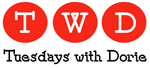
One suggestion: I think the Tuesday part could be a smidge thicker. It might be a little hard to read with the background but thickening up the font just a tad should do the trick.
Great job!
Oooooo very cute!
Cute, I agree with the thickening of tuesday.
Love it!!!!
I’m lovin it!
I love the ingredient list behind the words. Great!
I love it!
I love it!
love the blue and brown color scheme, nice choice!
Very sweet! Love the typefaces.
I love it, too!
I love the different fonts and the colors. Awesome job Carrie!
Love it! So cute!
Blue and brown. I love!
So cute! Love it!
Very cute!
Looks great!
Adorable!
I like it!
This is the one!
Yup, I love the colour scheme as well.
And I also agree about the thickening of “Tuesday”.
Nice button!
WOO HOO!! It looks beautiful :)
Very nice!
So cute!
Love it!
i love it too!
Thanks guys & gals… you all are too sweet! Laurie, let me know if you want Tuesday thicker or not.
beautiful– love the color combos and fonts!
I love it! I love brown and blue together.
Love it!
Looks great!
I really like it. Yah a button!
Love it!
Great job!
I’m a sucker for anything brown-and-blue so I like it. I agree with making Tuesday “thicker” – it would be easier to read.
Very cute!
Ditto on the Tuesdays. I love it, but it either needs to be a tad bolder, or lighten up on Dorie just a bit.
I’ve totally snagged the button… I hope that’s alright!
I’ll definitely remove it if there are any problems and I’ll be glad to change it if we decide to go with something else!


I love it!
I was just thinking how I really wish we had a button!
I love the look!
One suggestion: I think the Tuesday part could be a smidge thicker. It might be a little hard to read with the background but thickening up the font just a tad should do the trick.
Great job!
Oooooo very cute!
Cute, I agree with the thickening of tuesday.
Love it!!!!
I’m lovin it!
I love the ingredient list behind the words. Great!
I love it!
I love it!
love the blue and brown color scheme, nice choice!
Very sweet! Love the typefaces.
I love it, too!
I love the different fonts and the colors. Awesome job Carrie!
Love it! So cute!
Blue and brown. I love!
So cute! Love it!
Very cute!
Looks great!
Adorable!
I like it!
This is the one!
Yup, I love the colour scheme as well.
And I also agree about the thickening of “Tuesday”.
Nice button!
WOO HOO!! It looks beautiful :)
Very nice!
So cute!
Love it!
i love it too!
Thanks guys & gals… you all are too sweet! Laurie, let me know if you want Tuesday thicker or not.
beautiful– love the color combos and fonts!
I love it! I love brown and blue together.
Love it!
Looks great!
I really like it. Yah a button!
Love it!
Great job!
I’m a sucker for anything brown-and-blue so I like it. I agree with making Tuesday “thicker” – it would be easier to read.
Very cute!
Ditto on the Tuesdays. I love it, but it either needs to be a tad bolder, or lighten up on Dorie just a bit.
I’ve totally snagged the button… I hope that’s alright!
I’ll definitely remove it if there are any problems and I’ll be glad to change it if we decide to go with something else!
Just added it to my blog, it look so cute :-)
how do you add the button to your blog?